Advertisement
Graphs are like windows into your data—they help people see what’s going on instead of trying to figure it out from a long list of numbers. Matplotlib is a Python tool that lets you make those windows. If you’ve ever made a line chart or bar graph in school, you’ve already taken the first steps. But Matplotlib can do much more than basic charts. With a few tweaks and tricks, you can turn boring spreadsheets into clear, eye-catching visuals. Let’s explore ten advanced plot types you can use to make your data easier to understand—and more fun to look at.
Heatmaps are great when you want to show how values change across a grid. Imagine a map of classroom temperatures where hotter areas turn red and cooler spots are blue. A heatmap uses color to help your eyes spot patterns fast. It works best for things like comparing test scores across subjects or tracking changes over time and space.
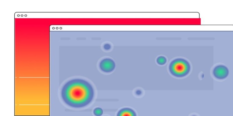
In Matplotlib, heatmaps are often made with a tool called Seaborn (which works alongside Matplotlib), but you can build one with imshow() and a color scale too. Just prepare a 2D list or array and let Matplotlib color each cell based on its number.
A normal scatter plot shows dots based on two numbers, like height vs. weight. But what if you want to group the dots by category—like boys vs. girls or red vs. blue team? That's where a scatter plot with categories comes in. You use different colors or shapes for each group, so the plot tells more than one story at a time.
In Matplotlib, you can do this by looping through your groups and plotting them separately with different markers or colors. It’s a clean way to explore relationships while keeping everything on one chart.
Step plots are like line plots, but they move in little stair steps instead of smooth lines. They're perfect when your data changes in chunks—like electricity bills, which update every month, or the number of students added every year. They help show when something changes and how much it jumps.
You can use plt.step() in Matplotlib to make one. It’s especially useful when the timing of changes matters more than the trend.
What if you want to show not just the line of a trend but how big the area under it is? That’s where filled area plots come in. These plots color the space between the curve and the baseline, giving a quick visual sense of volume or total value.
Filled plots are used in finance, energy tracking, or anything where total size matters. You can make one with fill_between() and even compare two lines by shading the area between them.
A violin plot shows how values are spread out—not just where the average is, but how wide or skinny the distribution is at different points. It’s like a fancier box plot with curves.
This is helpful when you want to compare groups not just by average but by how their values are shaped. Violin plots help spot outliers, unusual spreads, or group similarities. Seaborn makes it easy to add violin plots, but you can build custom ones in Matplotlib, too.
Sometimes, one graph isn't enough. If you want to compare data across multiple groups or time periods, you can use subplots to lay out several mini-charts in one window. This helps viewers see differences or trends across groups without flipping back and forth between graphs.
With plt.subplot() or plt.subplots(), you can create side-by-side plots that share axes or titles. It’s a powerful way to organize a lot of visual info in a small space.
Streamplots are used to show direction and flow—like wind currents or water streams. Instead of simple arrows, they use flowing lines that change direction smoothly. This makes them ideal for showing movement, especially in physics or simulations.
In Matplotlib, streamplot() lets you draw these paths with arrows that point in the direction of the flow. You feed it two sets of 2D values for direction (U and V), and it maps out the flow.
Basic line charts are good, but when you add annotations—labels, arrows, and highlights—they become great. You can point out milestones, changes, or surprises in your data directly on the plot.
Using annotate() or text() in Matplotlib, you can call attention to important data points. This turns a regular line graph into a storytelling tool.
Sometimes, one part of a chart is more interesting than the rest. An inset plot puts a mini-chart inside the main one, zooming in on a small section. Think of it like using a magnifying glass.
In Matplotlib, you can do this by creating a second set of axes inside the first. This lets viewers focus on a critical moment or spot without losing sight of the whole picture.
Radar charts are shaped like a spider web. They’re great for comparing things with multiple qualities—like how different sports players rank in speed, strength, skill, etc. Each line stretches from the center, and each item’s shape shows its overall profile.
Matplotlib doesn’t have a built-in radar chart, but you can make one using polar coordinates. You draw lines at equal angles and plot values outward like spokes on a wheel. It takes a little setup but looks impressive and informative.
Data is more useful when people can actually understand it. Advanced plots in Matplotlib help you tell clearer, smarter stories with your numbers. From flow and movement to comparisons and patterns, each plot gives a different way to explore the same data. Whether it’s a radar chart, violin plot, or a simple filled area chart, the right visual can make all the difference. And once you know how to use these tools, turning numbers into insight becomes a lot more fun.
Advertisement

Explore the most reliable data science platforms in 2025. From notebooks to automated modeling, find the best tools for data science across all skill levels

Confused by AI buzzwords? This glossary breaks down 29 essential terms—like LLMs, embeddings, and transformers—into plain language anyone can understand

Know what an AI accelerator is, how it works, and why it's vital for powering today's smart tech and intelligent systems

Learn how artificial intelligence organizes random data, increases output, and drives efficiency throughout content management

DataRobot's Feature Discovery runs inside Snowflake, offering more secure and scalable machine learning feature engineering

In daily life, inductive arguments transform ideas, guide behavior, and enable intelligent choices grounded on noticed trends

From sorting files to predicting storage needs, see how AI helps manage and optimize your data storage without any effort.

Discover UiPath's latest update with smarter AI bots, easier bot design, improved integration, and powerful automation tools

Learn how to create effective charts using ggplot in Python. This guide covers syntax, setup, and examples for powerful data visualization using the plotnine library

Adobe plans to integrate generative AI tools from OpenAI and others to boost creative workflows and user productivity

Dive into the strengths and weaknesses of open-source AI models and what they mean for innovation.

Looking for the best AI grammar checkers? This guide lists the top tools to improve clarity, fix errors, and make your writing sharper with ease